It was important to build an identity for Lowicks that would evoke the sense of trust and authenticity, valued by its community of over
25k vetted members. The founders wanted this
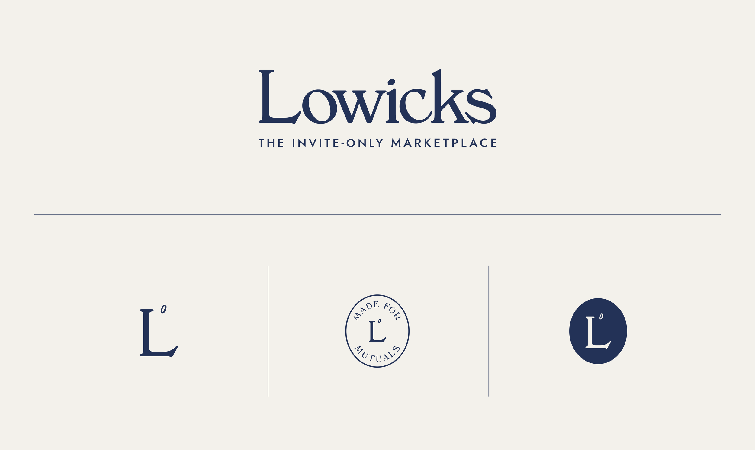
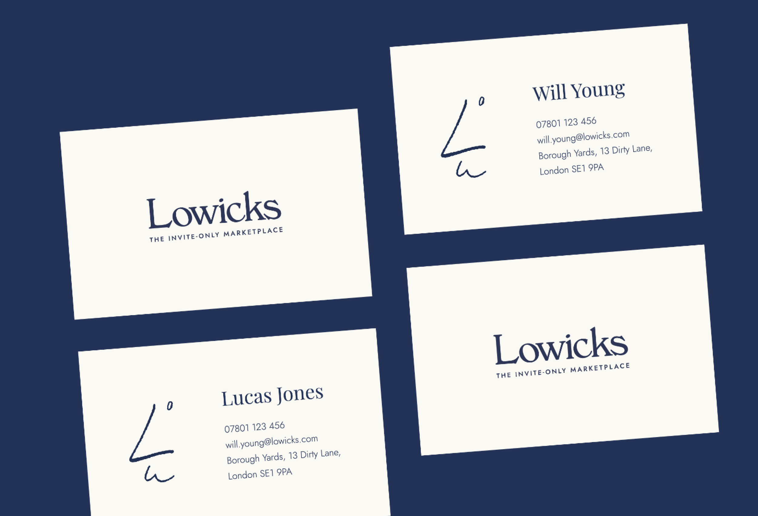
to feel like an evolution of the existing identity - which was reflected in the custom wordmark logo.
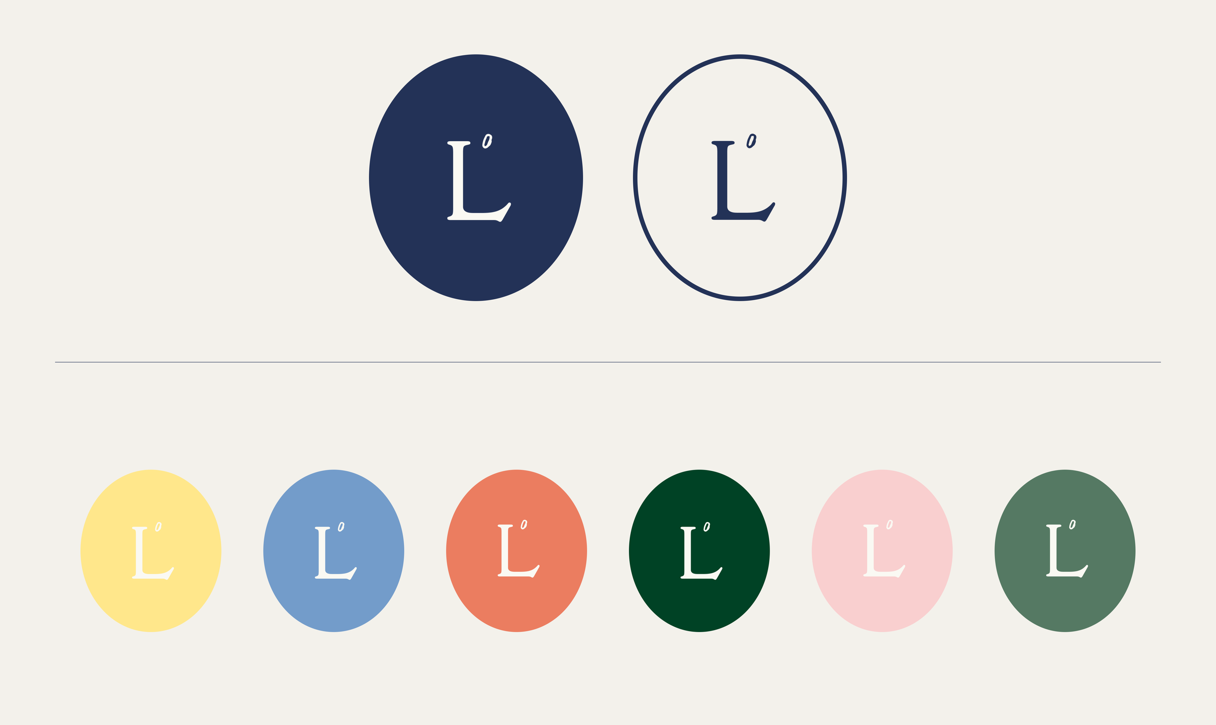
Choosing a classic serif typeface, whose characters interact closely to convey community
and connection. The ‘o’ and ‘c’ are angled in a nod to playful personality of the wider identity.
VISUAL IDENTITY
Logo suite / Colour palette / Illustration / House typography / Brand TOV + copywriting / Design system / Core brand assets / UI design /

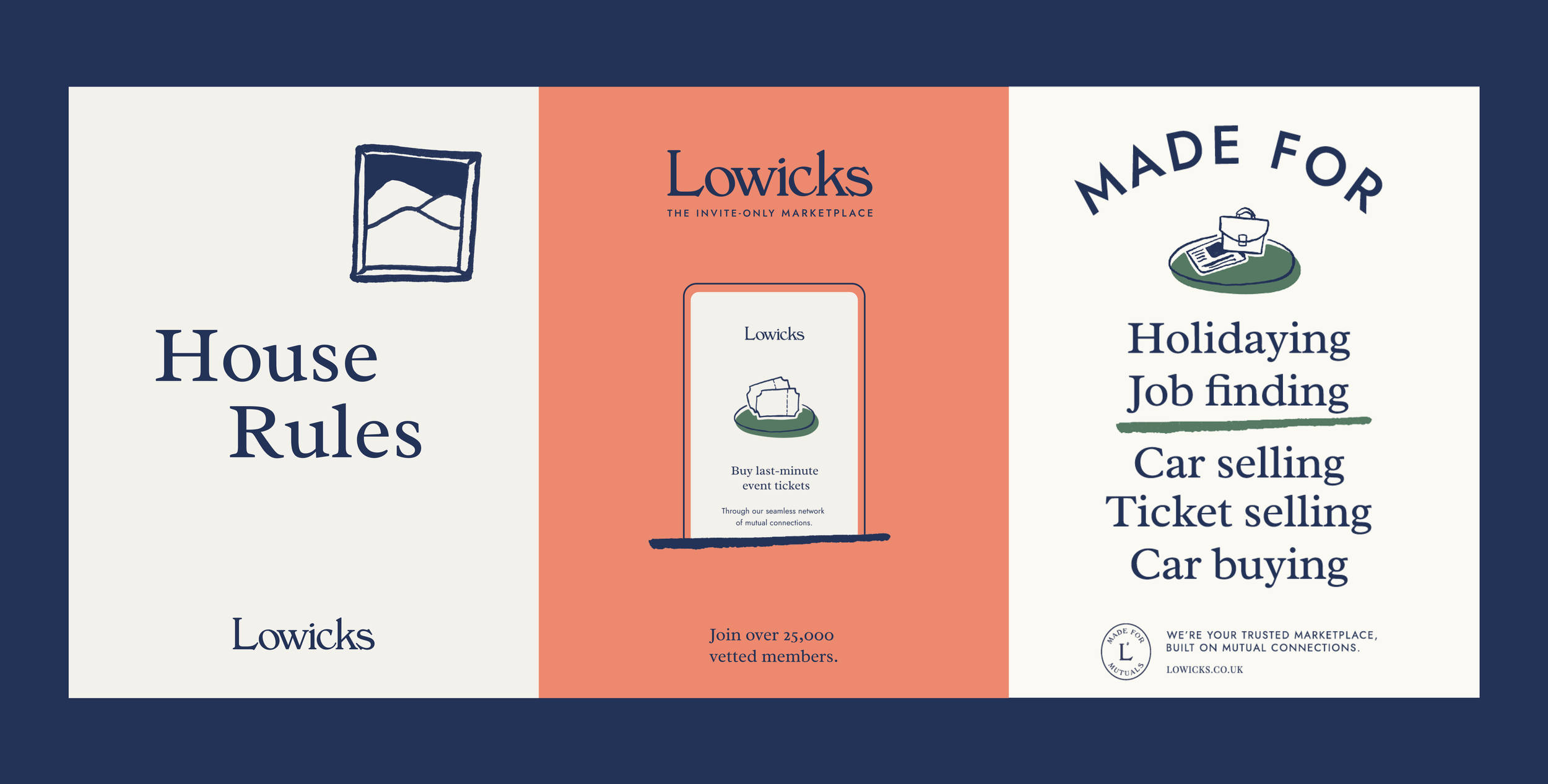
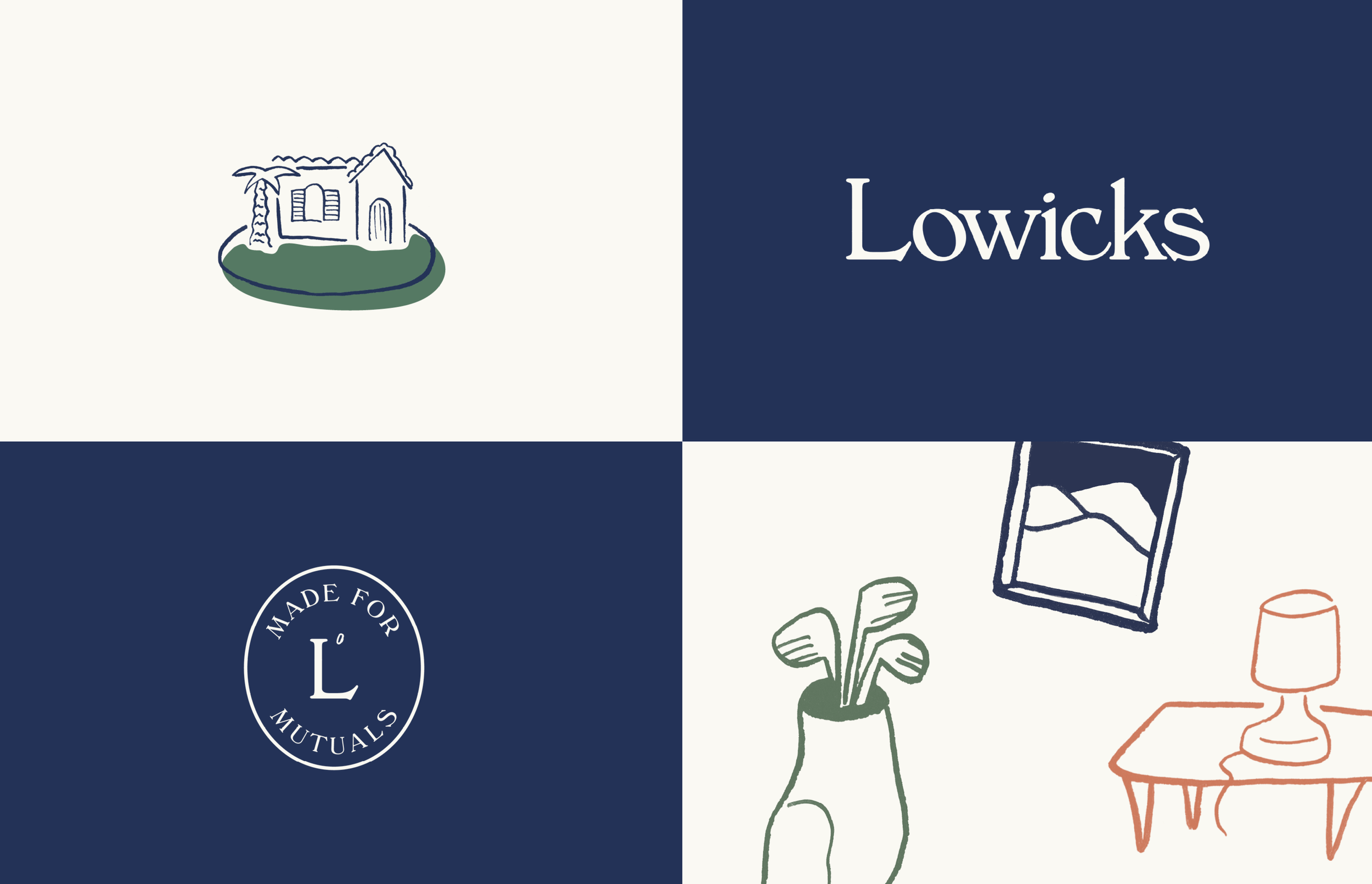
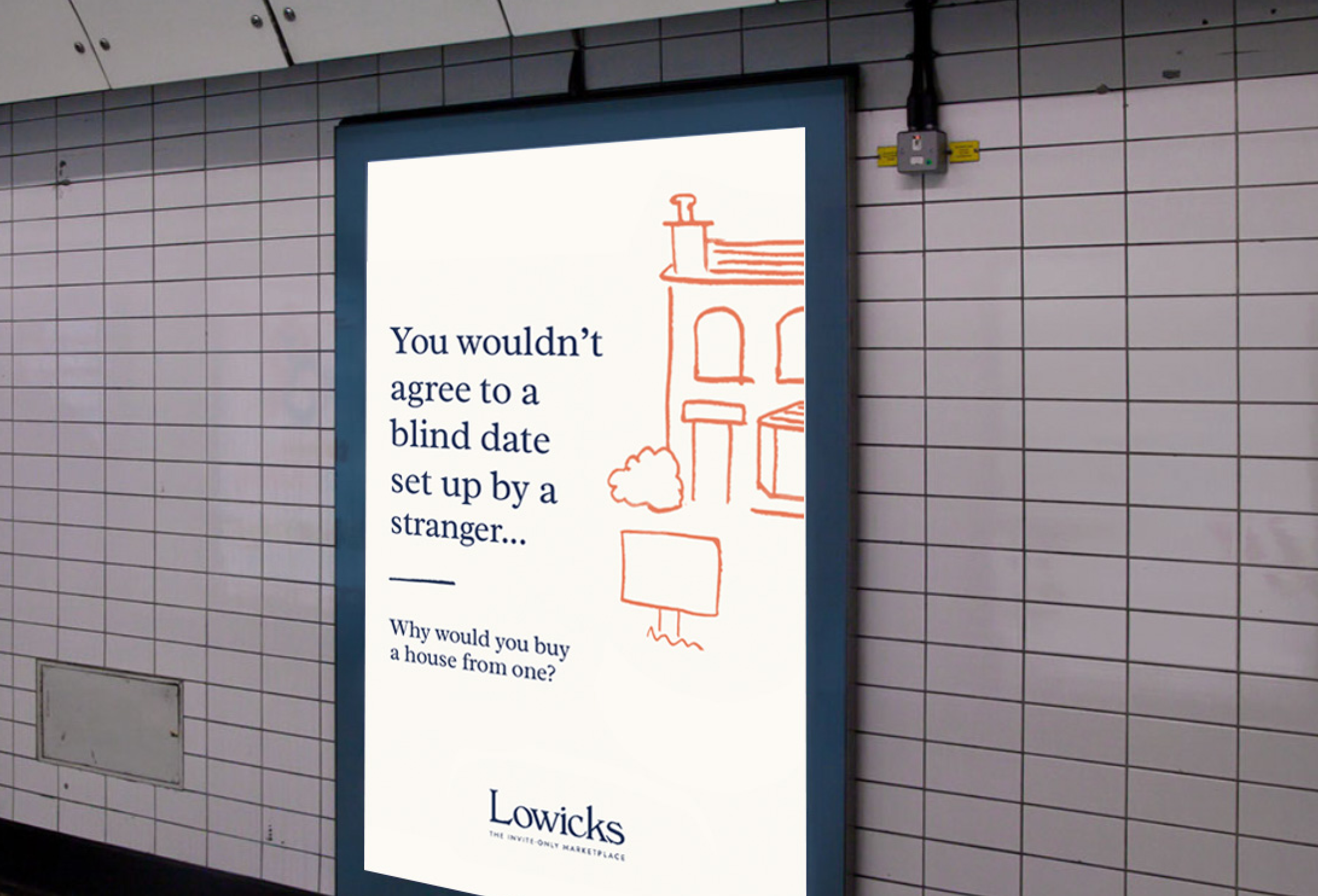
Made for mutuals
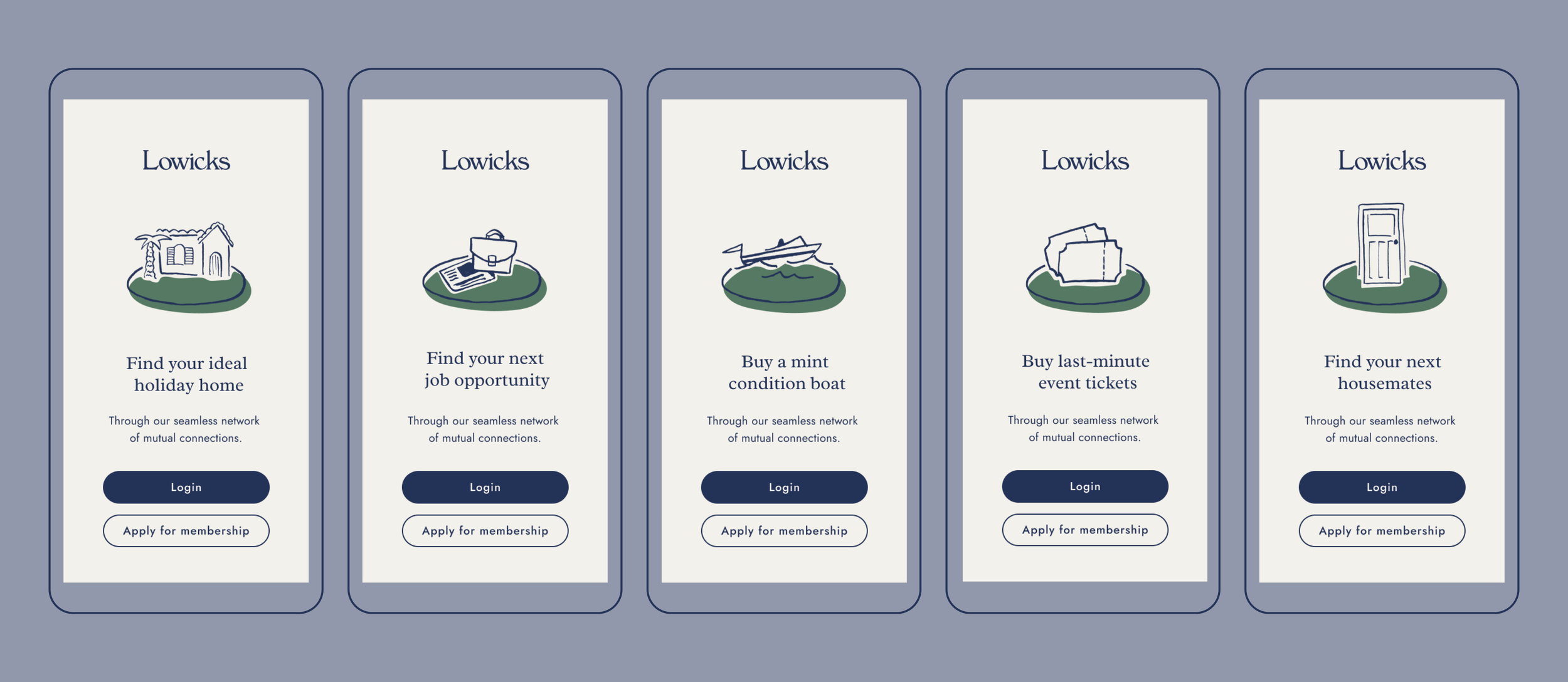
Lowicks is made for house listings, ticket sales, job opportunities, holiday homes... you name it. But first and foremost, it’s a community that’s made for mutuals.
This felt like something that needed to be apparent in every layer of the identity. The degree symbol is a motif for the degrees of separation between members
- a shape and form that can be seen throughout the design system.
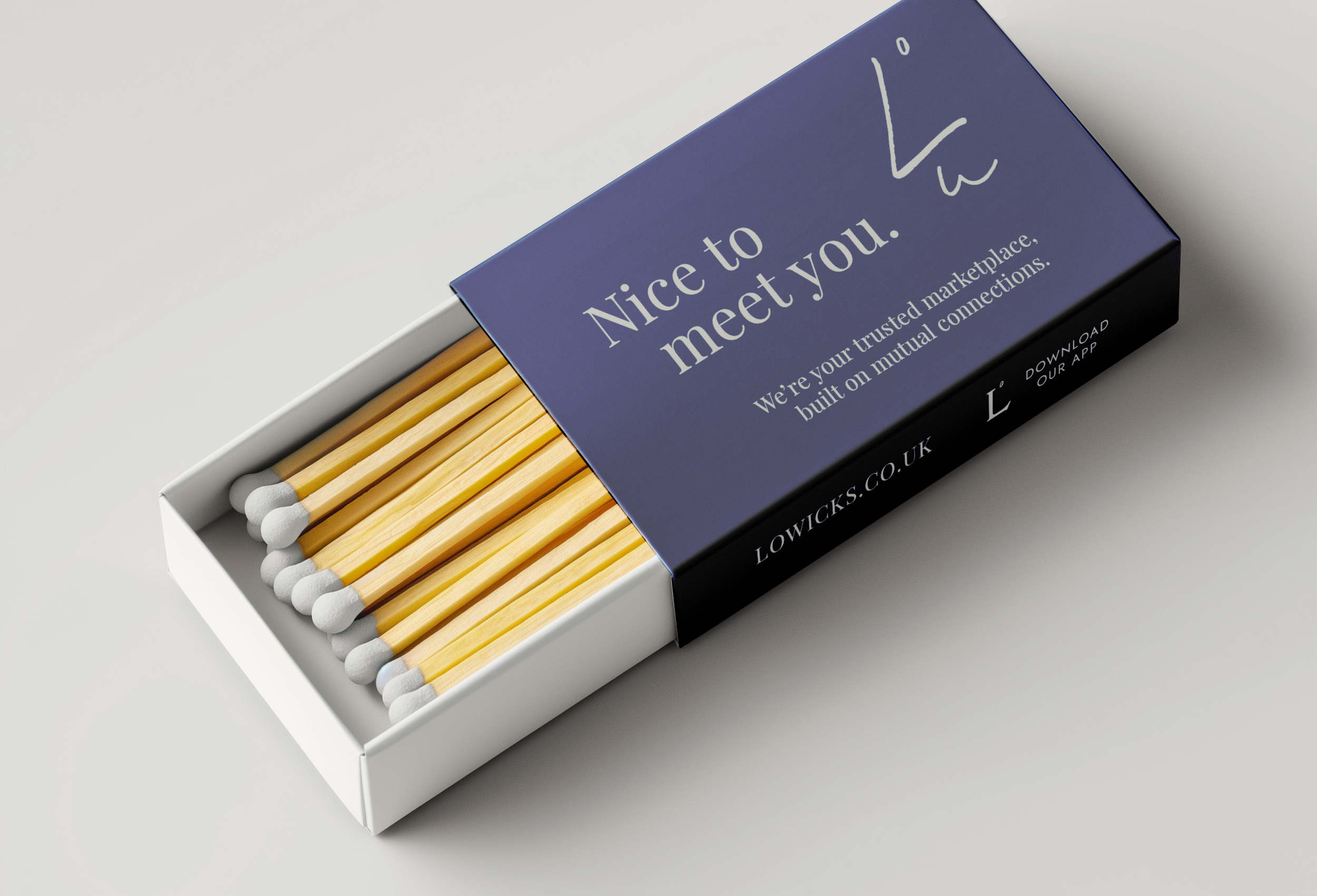
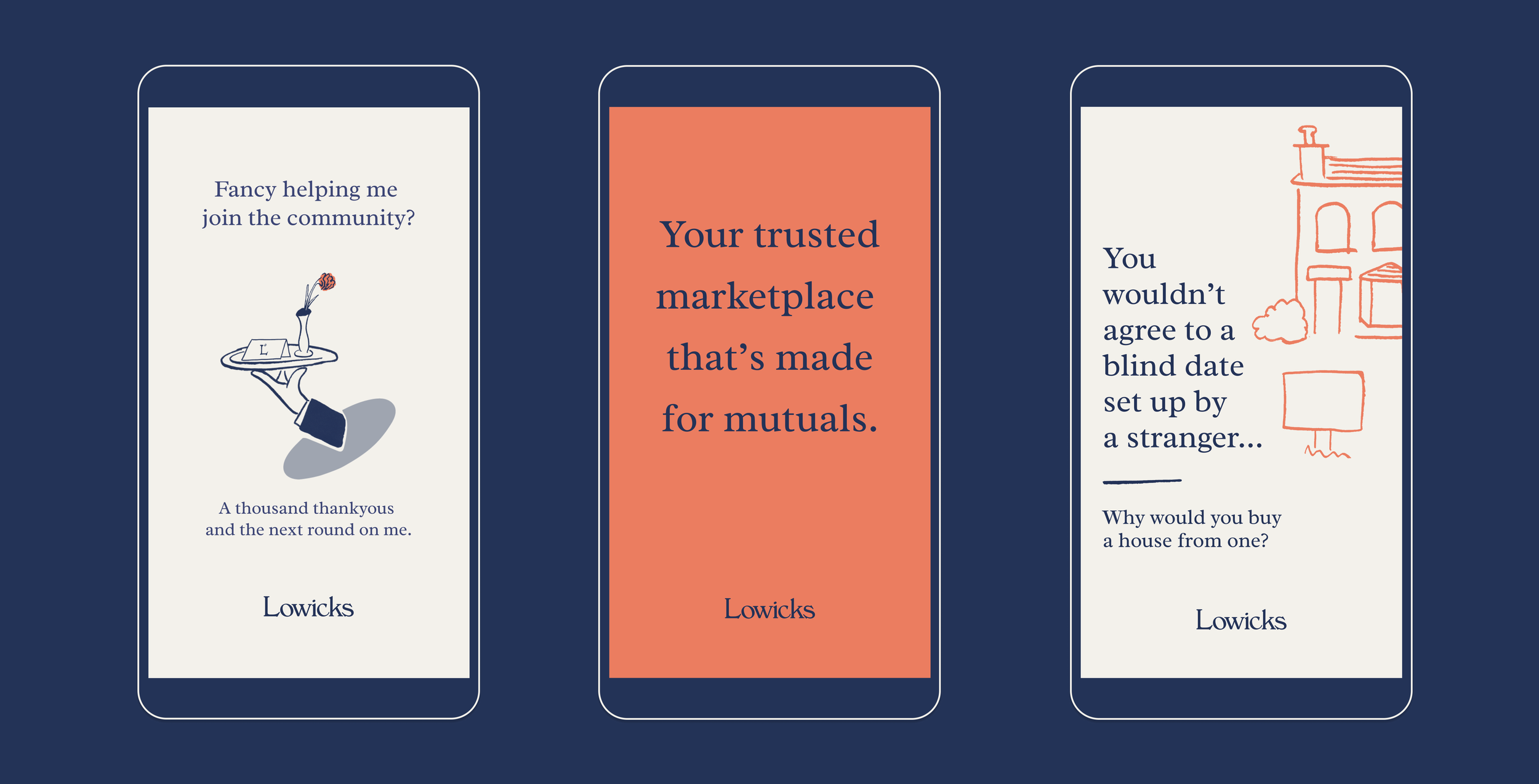
As a literal face of the brand, Louie the
concierge is a character created to act
as the front of house for Lowicks.
Present throughout the customer journey to offer a helping hand and uphold
the community house rules, he’s there to make users feel at home whether they
are a new member or an old friend.
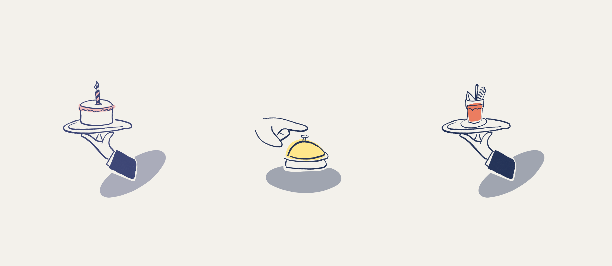
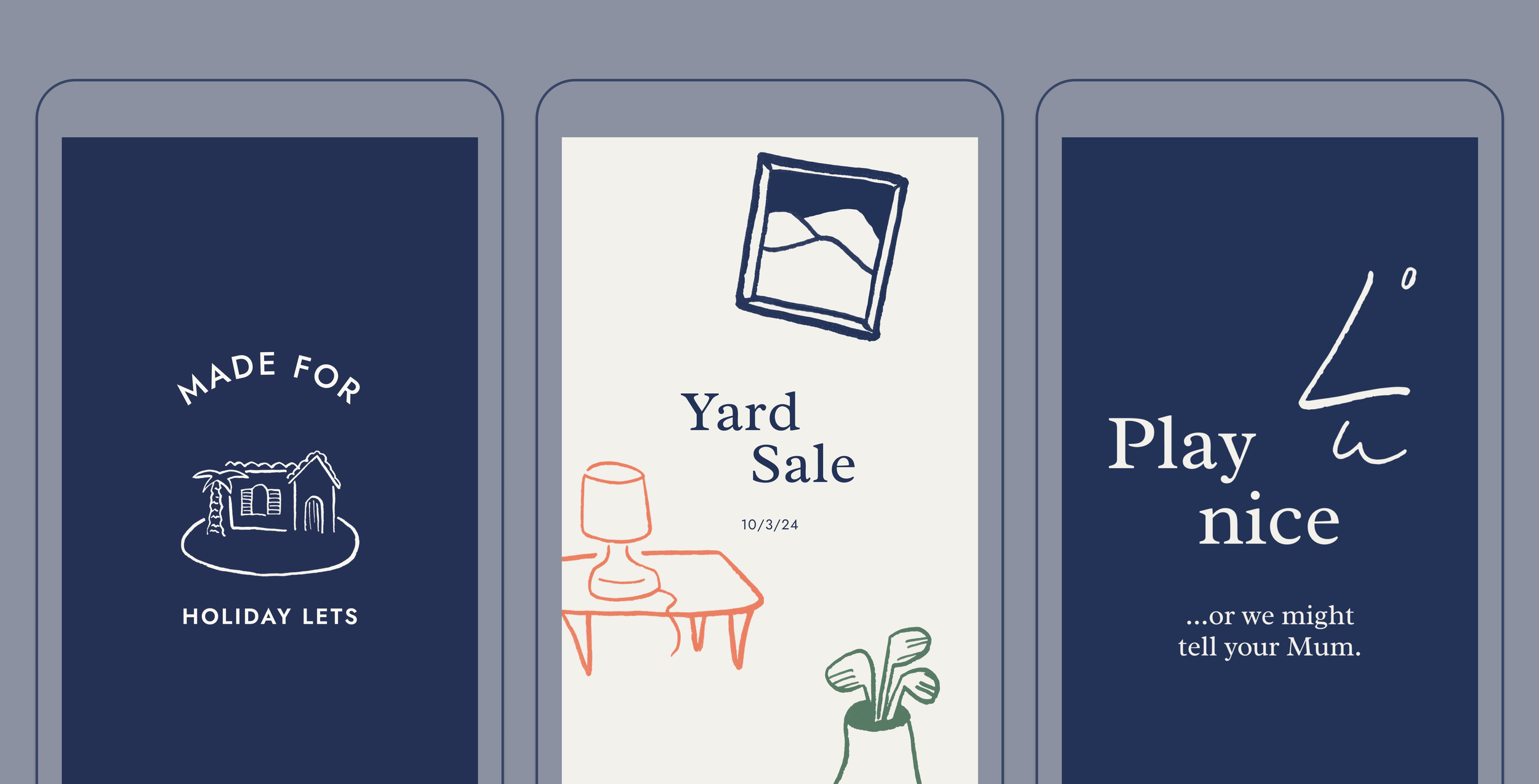
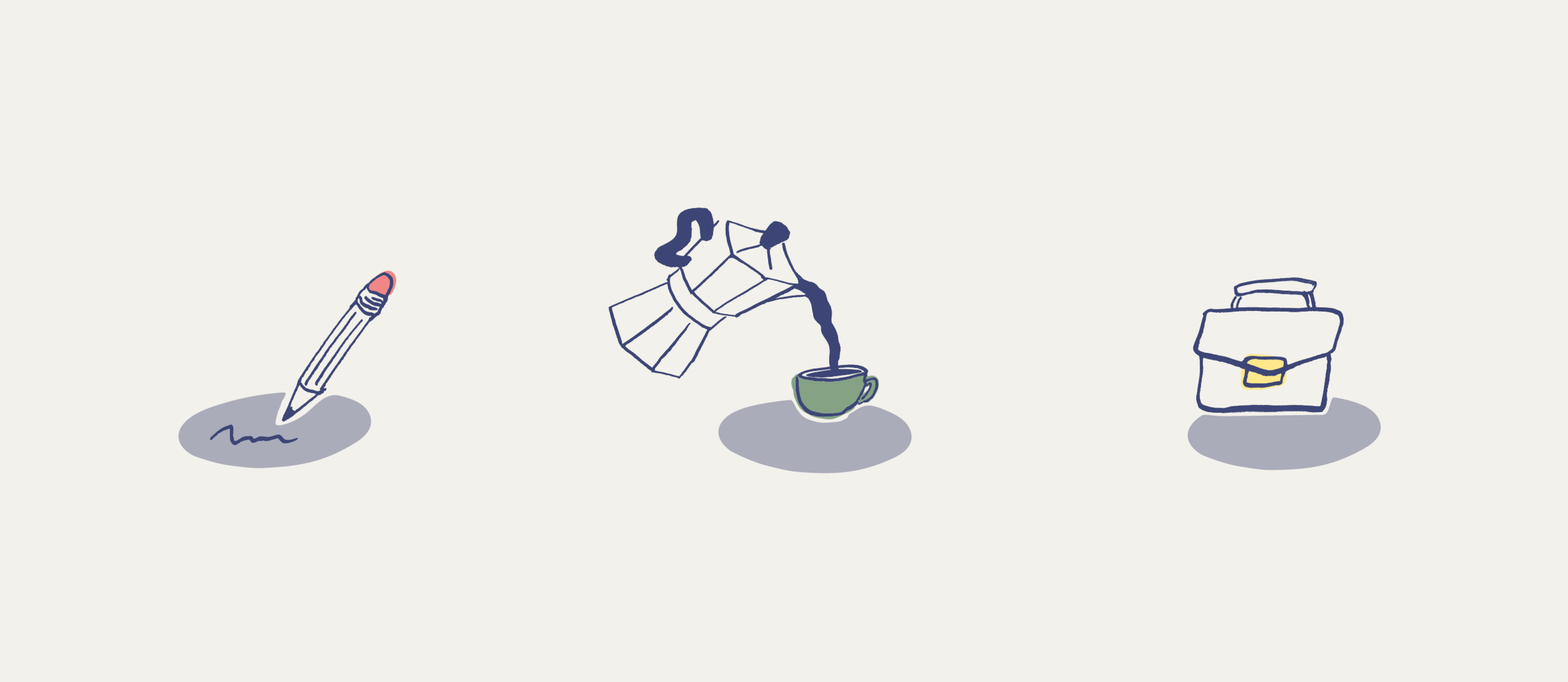
A warm and familiar tone of voice is paired with playful illustrations that showcase the breadth of categories available through the marketplace.
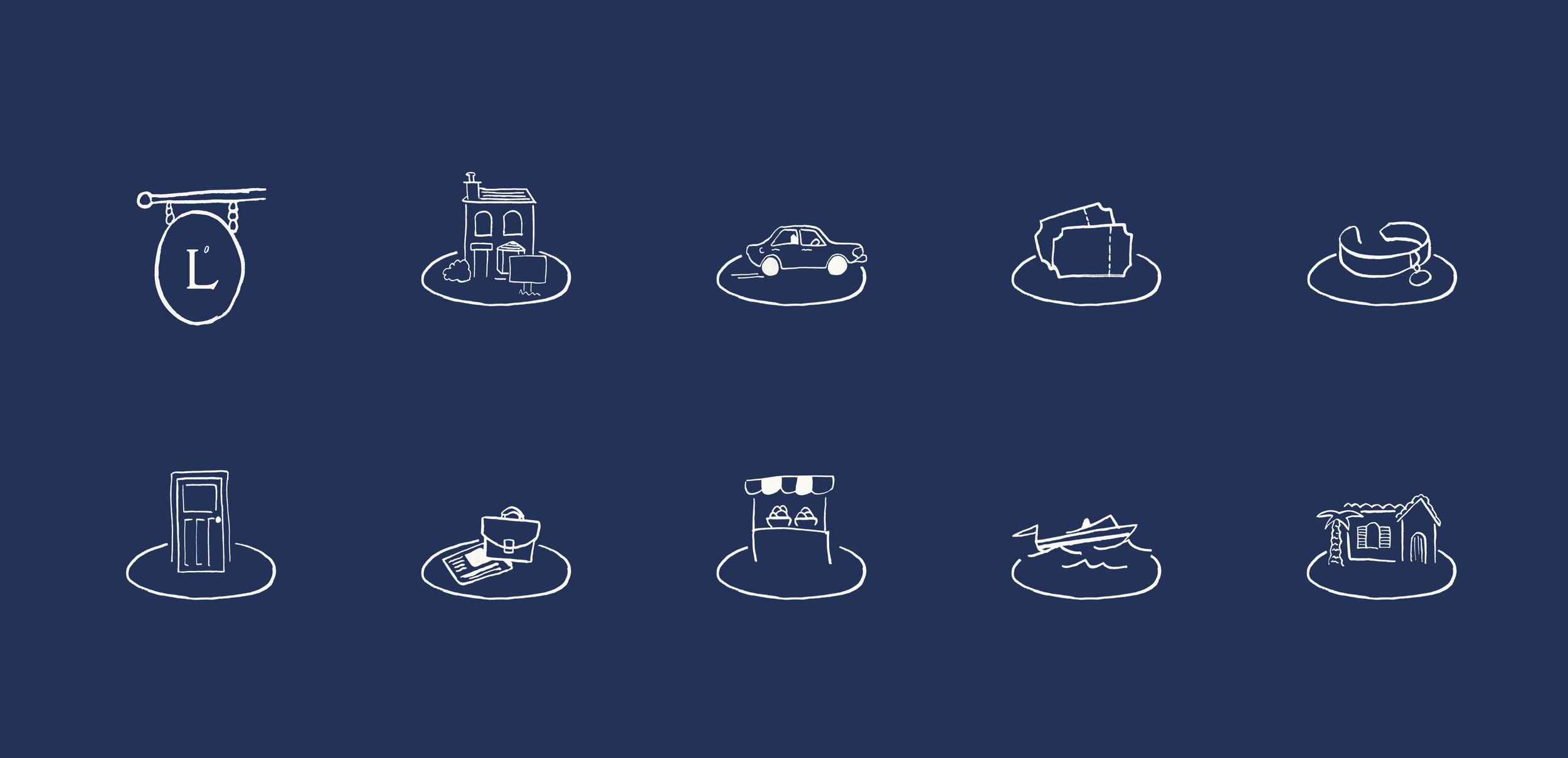
Depth for a digital platform
The illustrations needed to work hard to create a sense of consistency and
brand presence, as the imagery for each listing is uploaded and supplied by community members themselves. Limited control over the imagery led to
creating a characterful library of spot and category illustrations
to add charm, personality and an approachability to the identity.