A Danish organisation with a holistic approach to trauma healing, and a mission to be the light that shines in the darkness for those struggling with mental health. Embolc look to treat the body, psyche, mind and soul as a unified whole rather than separate entities - so the notion of balance and cycles was at the centre of this visual identity.
VISUAL IDENTITY
Logo suite / Colour palette / Illustration / House typography / Brand TOV + copywriting / Design system /
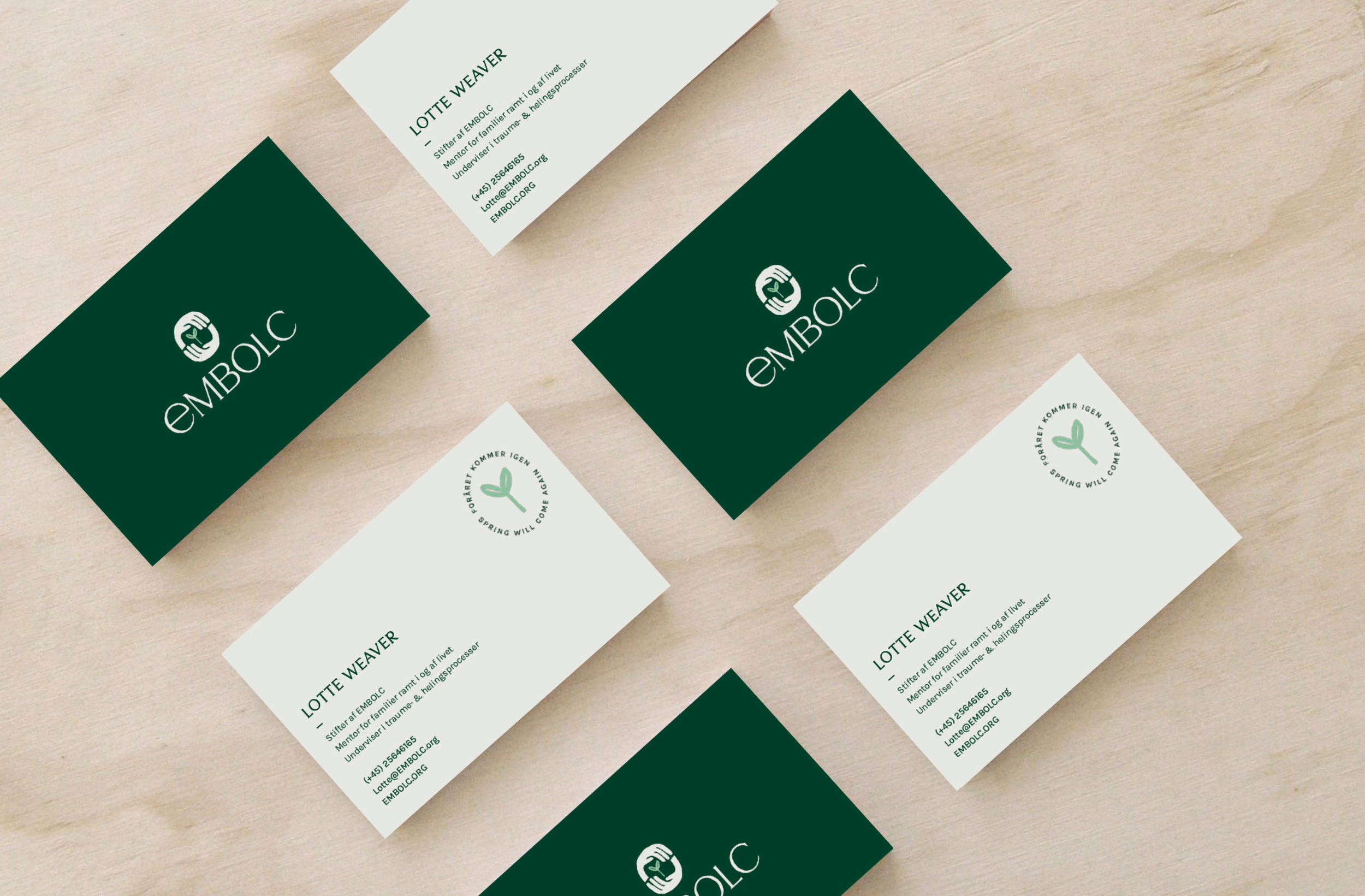
Core brand assets
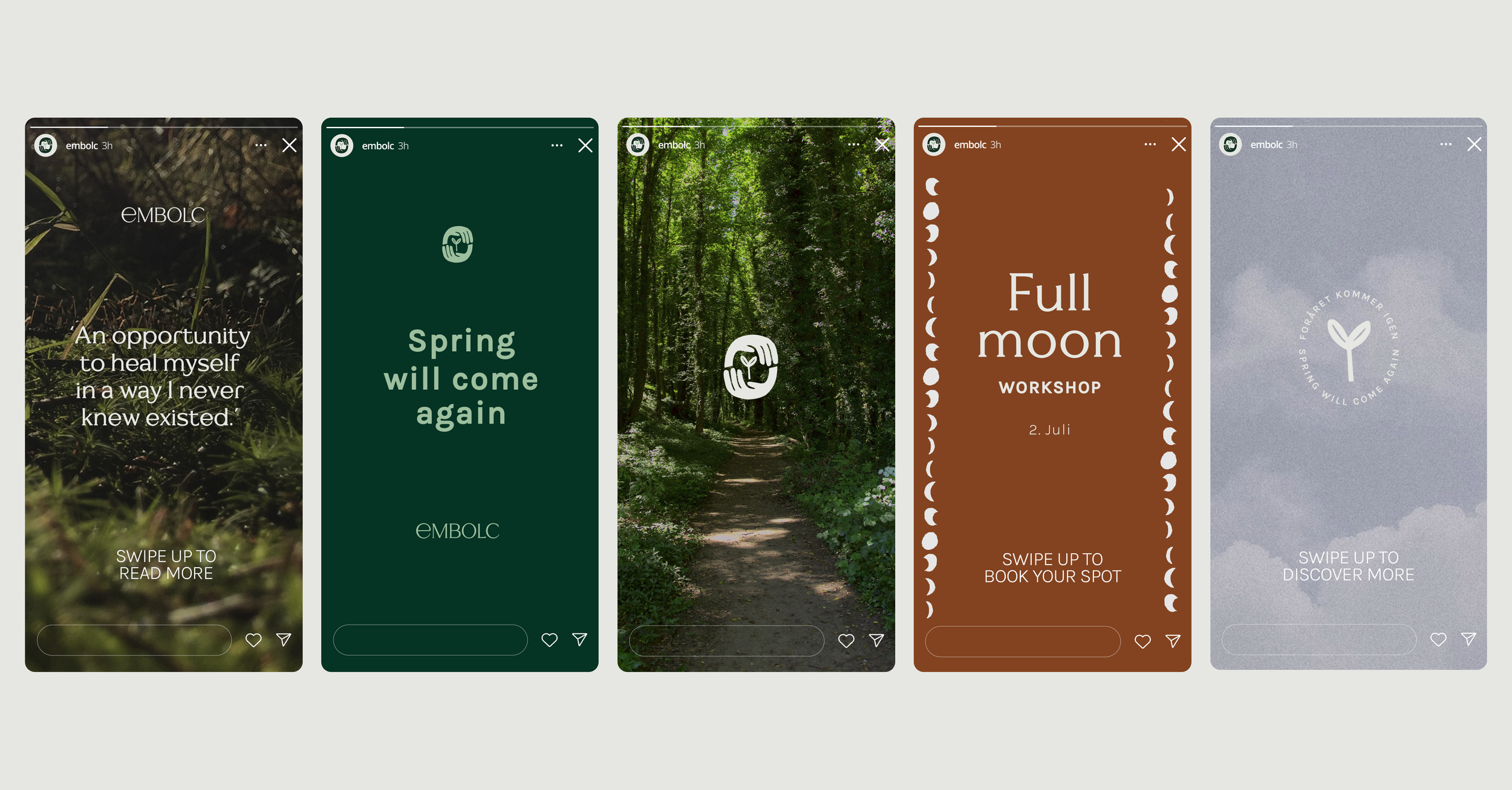
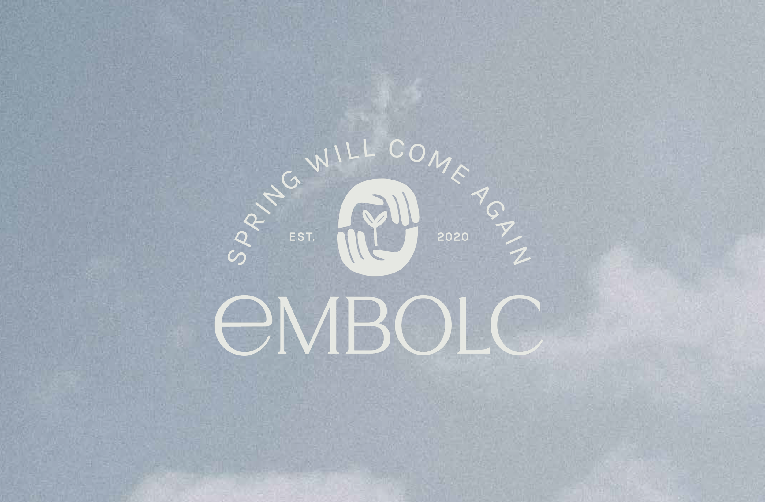
Spring shoots after a long winter
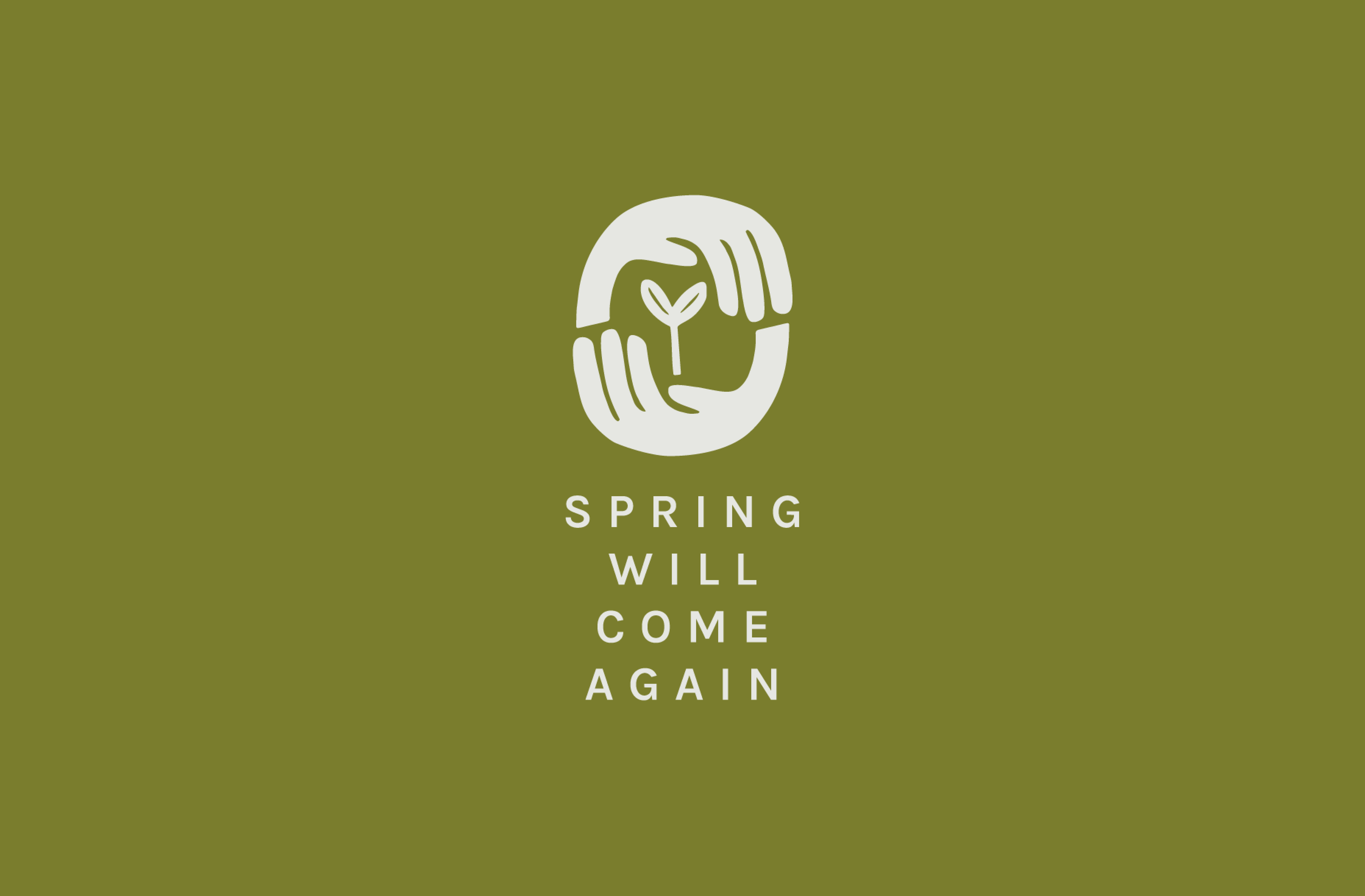
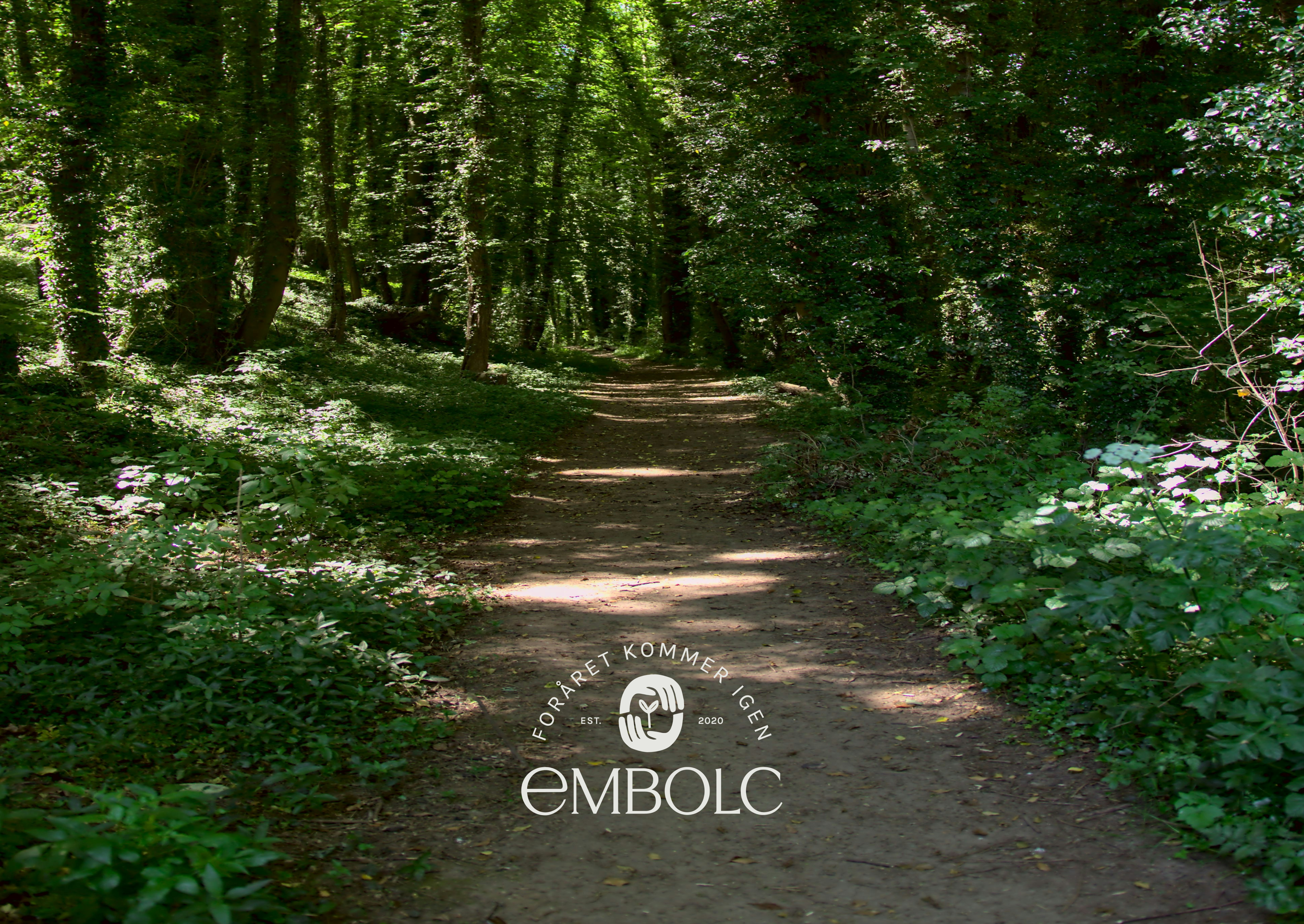
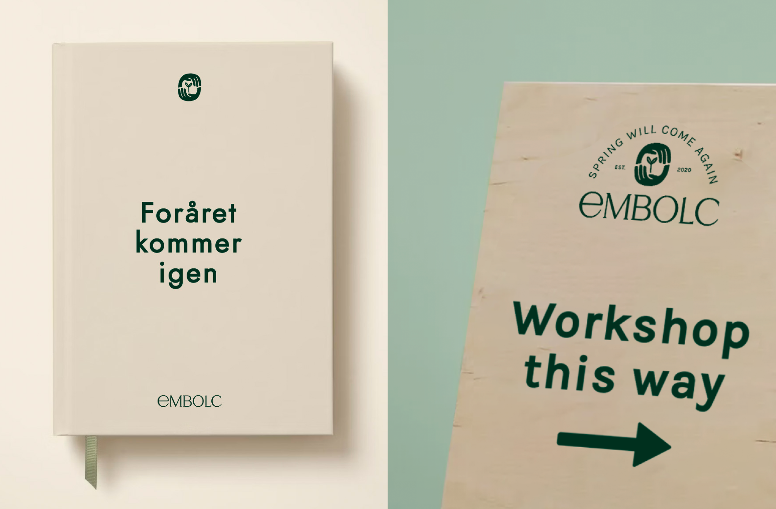
The word ‘embolc’ means ‘in the belly’, and refers to the fertile interior of Mother Earth where small spring shoots are sprouting. It is also one of the four Celtic fire festivals - one that celebrates the return of light after a long winter. A spring shoot, sheltered by balanced interlocking hands forms the brandmark, communicating the nurturing mission of the organisation and attaching meaning to the wordmark.
The identity acknowledges the integral role of both dark and light in our day to day existence -
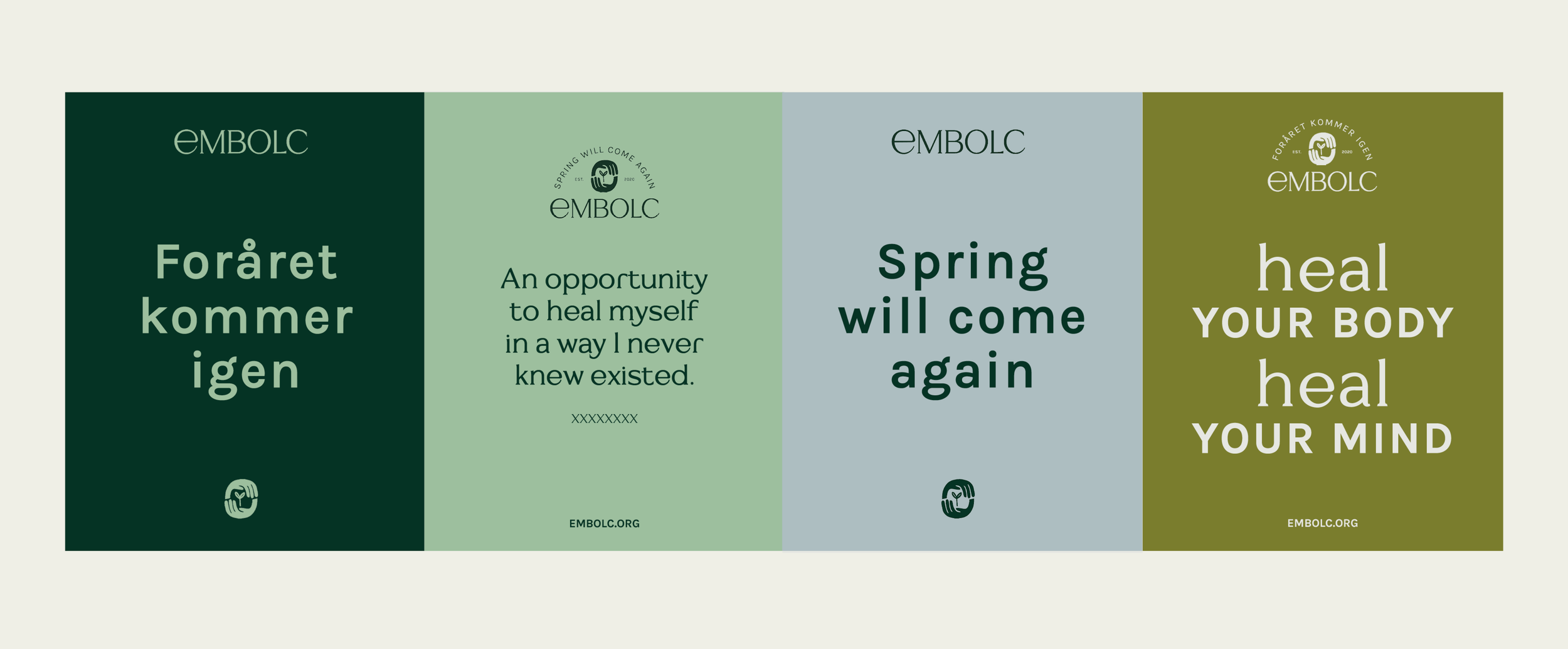
as you cannot have one without the other. This intrinsic sense of balance and cycles can be seen throughout the natural world; day and night, seasons, the circle of life. The message of hope that ‘spring will come again’ acts as a positive mantra here, one that works in both Danish and English.
Dark and light
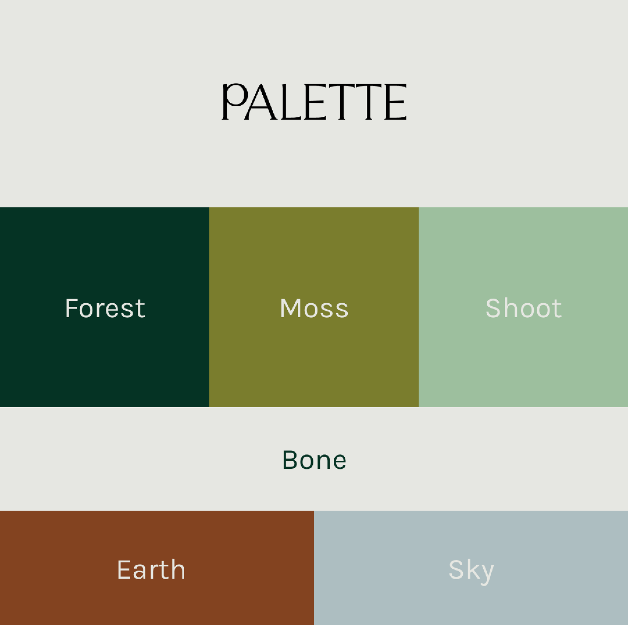
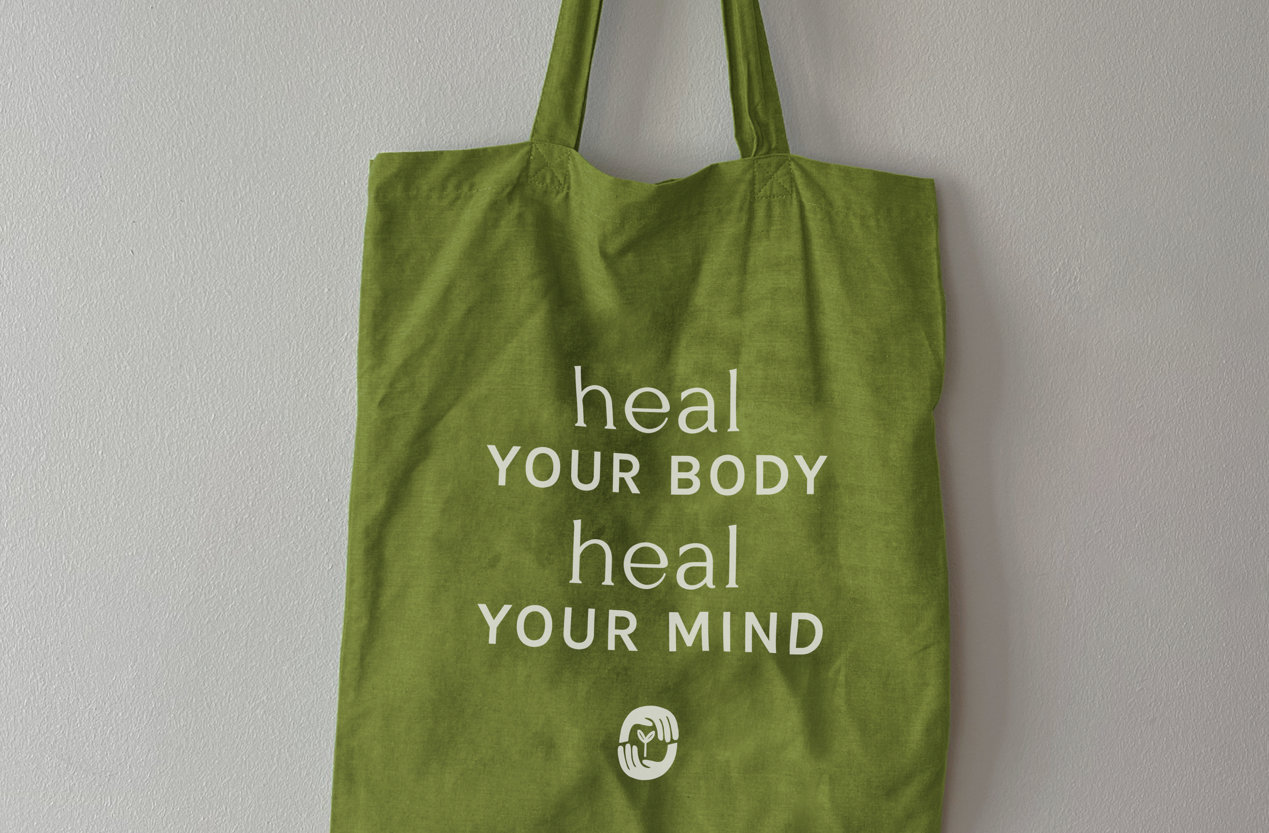
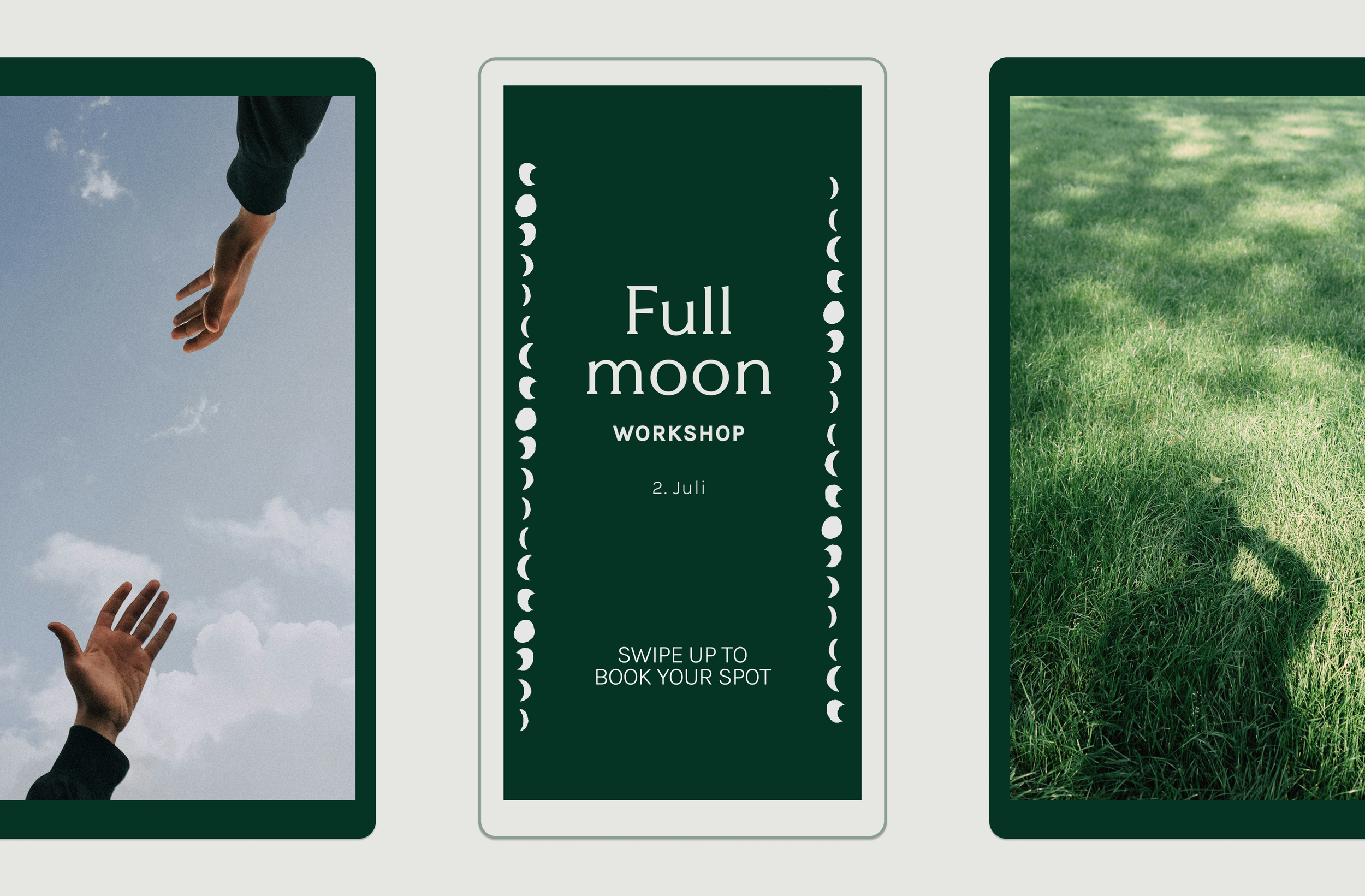
The organic forms of the linocut style illustration accentuates the human element of the organisation, adding warmth and approachability to the identity. Hands are used as a relatable motif for connection and togetherness and represent Embolc’s holistic approach to health. The colour palette also takes inspiration from elements of the natural world such as moss, bone, sky and earth - providing a versatile design system for the brand messaging.
Human touch